This UX case study is about improving the onboarding flow for PubHubs. This was done in collaboration with Amsterdam University of Applied Sciences.
I worked together with a UX researcher, who helped conduct user interviews to test the prototypes I made.
What is PubHubs? PubHubs is a new privacy friendly community platform that is being developed by the Radboud University & University of Utrecht. And in collaboration with multiple large public organisations.
It is similiar to Discord and Slack in functionality. On PubHubs users can join ‘hubs’, which are a collective of ‘(chat)rooms’. On discord this would be called a ‘server’.
PubHubs is a large ongoing project
Collaborators
Radboud University
Amsterdam University of Applied Sciences
My role
UX design
UI design
Wireframing
Prototyping
UX testing
Illustrations
All-round design
Timeline Oct 2024 – Jan 2025 Fourth interation coming soon.
Problem breakdown
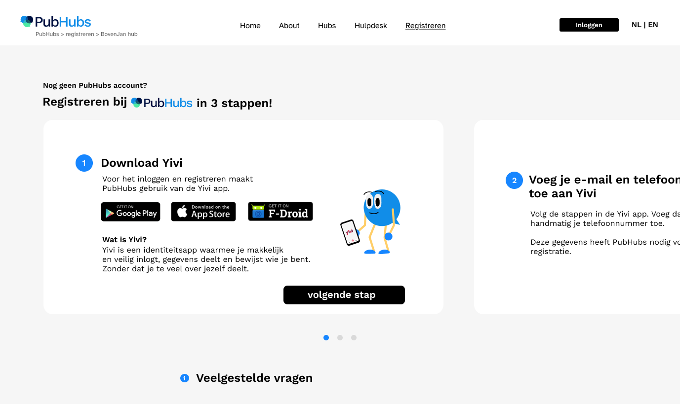
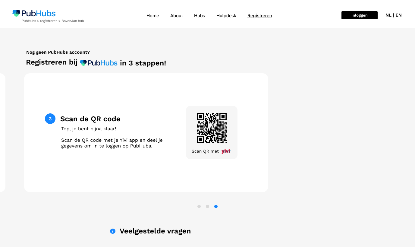
Users have difficulty registering with Yivi The core of PubHubs is that it’s privacy friendly, which is why it makes use of the identity wallet ‘Yivi’ to login and register to the platform. However this comes with a few design challenges.
What is Yivi? Yivi is what is called an identity wallet. It’s an app that allows you to show only selected pieces of personal information when needed.
It’s not clear for the user what they’re signing up to.
Users are unfamiliar with Yivi / identity wallets.
Having to install a third party app to sign up causes friction.
Challenges🥊
Make clear what PubHubs is and what it has to offer the users.
Introducing the user to Yivi and the concept of identity wallets without overwhelming them.
Make it clear why PubHubs uses Yivi, and convince the user to download the Yivi app.
Make users feel welcome when first encountering PubHubs.
Concepting & idealisation
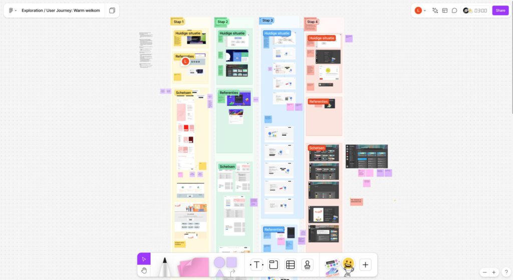
User journey & design exploration I began by sketching out a user journey to get a clear overview of how to structure the first clickable prototype an then I decided on what screens I was going to design for the first user interviews.
Context Because of the user group we were going to test with, I decided on designing a flow where the user enters PubHubs via an external website. In this specific case it was the website of a mental health group. This mental health group has their own “hub” on PubHubs. A hub is the equivalent of a Discord server and Slack group.
Interviews We had several users sign up for our interview. The interviews were held by me and the UX researcher I was collaborating with. Before the interviews we made a document with all our questions and goals.
One of us took notes while the other conducted the interview itself. In the interview we gave the user a link to our prototype and had them navigate through the prototype while telling us their thought proces.
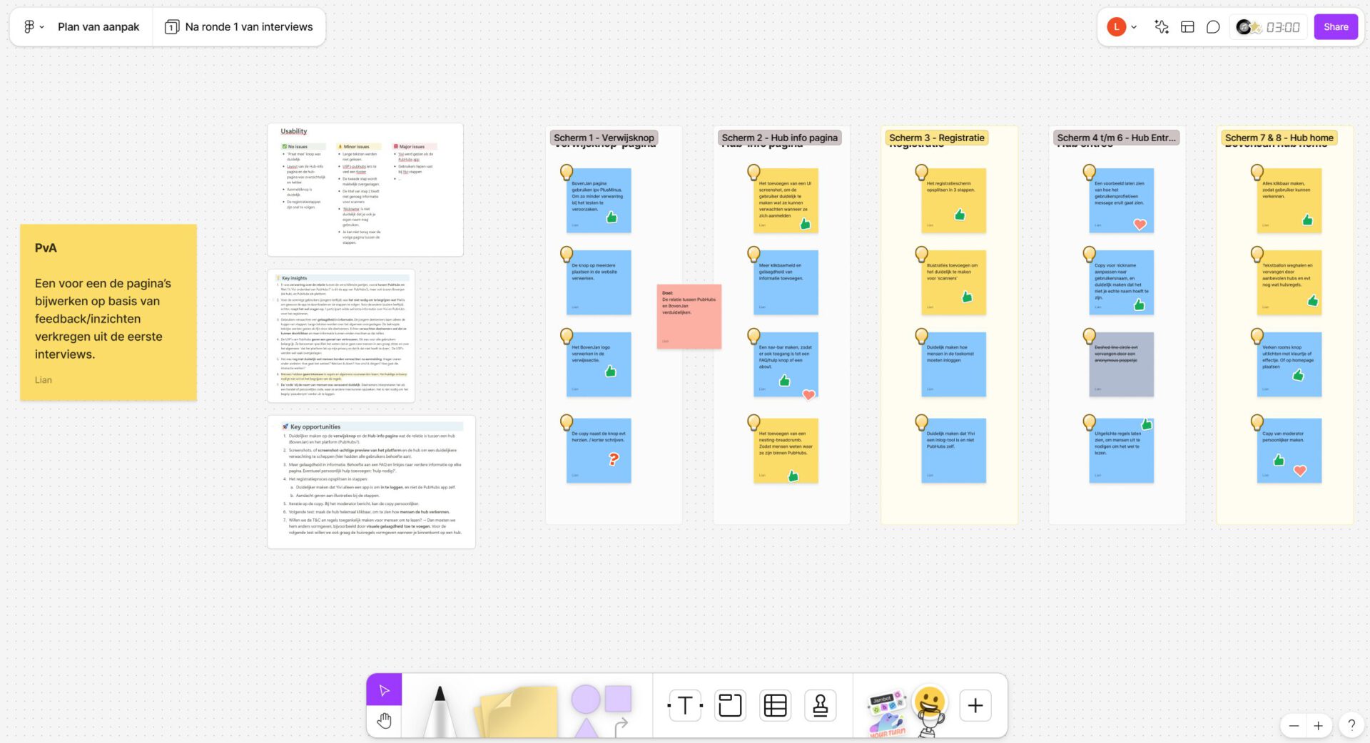
After the interview we made a research document in Notion, detailing our insights and opportunities for the next iteration.
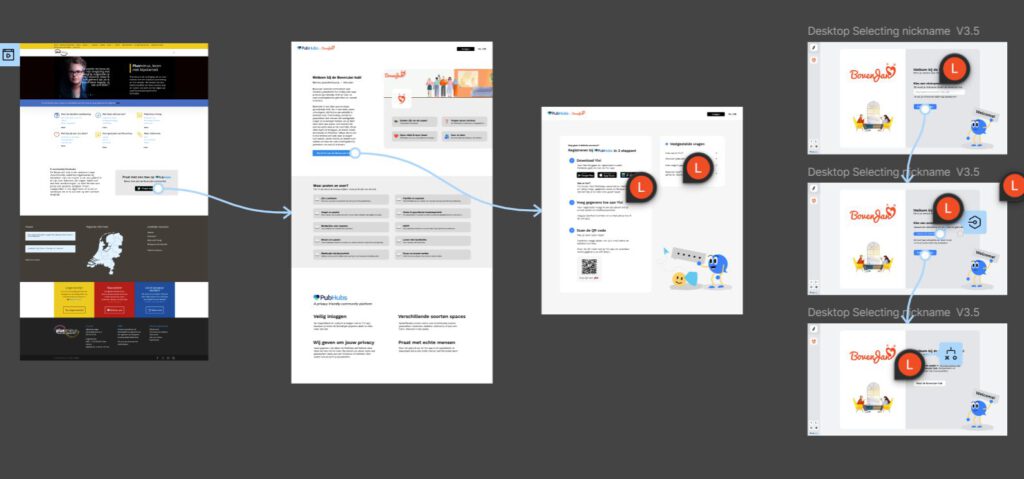
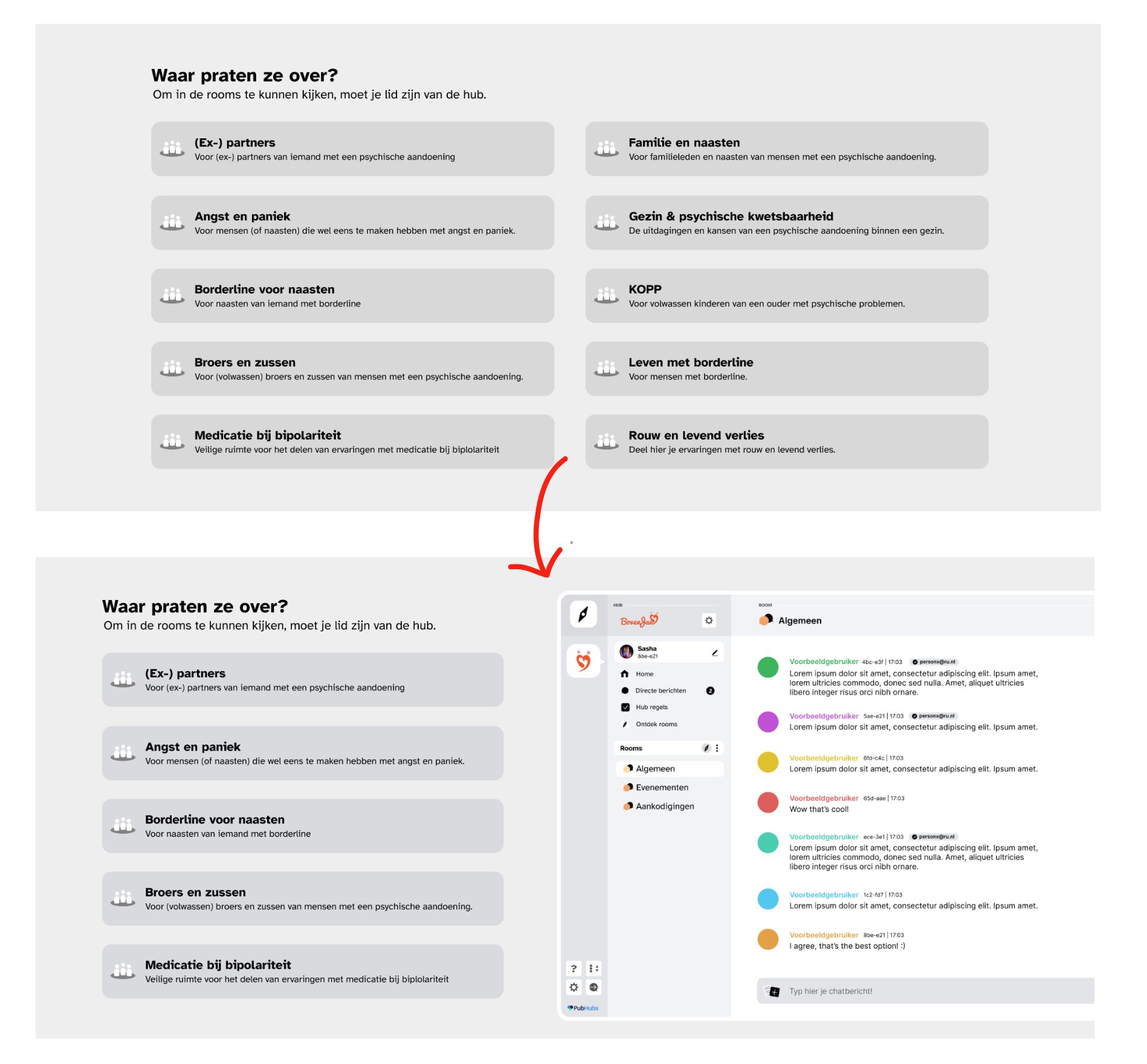
The hub information page The purpose of the second page in the prototype is for users to be able to see what this Hub is all about and what they can expect. Along with information about what PubHubs is and a button to register with PubHubs/join the hub.
Insights 🟢The users described the page as clear 🟢the registration button was easily found.
🟠Some users would’ve liked more layered information. 🟠The page doesn’t invite the user to scroll down.
🔴Users were confused about the difference between PubHubs and the mental health care organisation. 🔴 Users didn’t know what to expect after registration.
The registration flow For the registration flow I opted for testing out if putting all 3 steps on one page would be overwhelming for the user.
Insights 🟢You have a quick overview of what to expect 🟢Users were able to follow the steps quickly
🟠Step 2 is often skipped by people who don’t read 🟠The FAQ isn’t obvious due to the steps taking all the attention.
🔴 Users are confused as to what Yivi is and where it comes from. 🔴 There were some issues with the Yivi app itself.
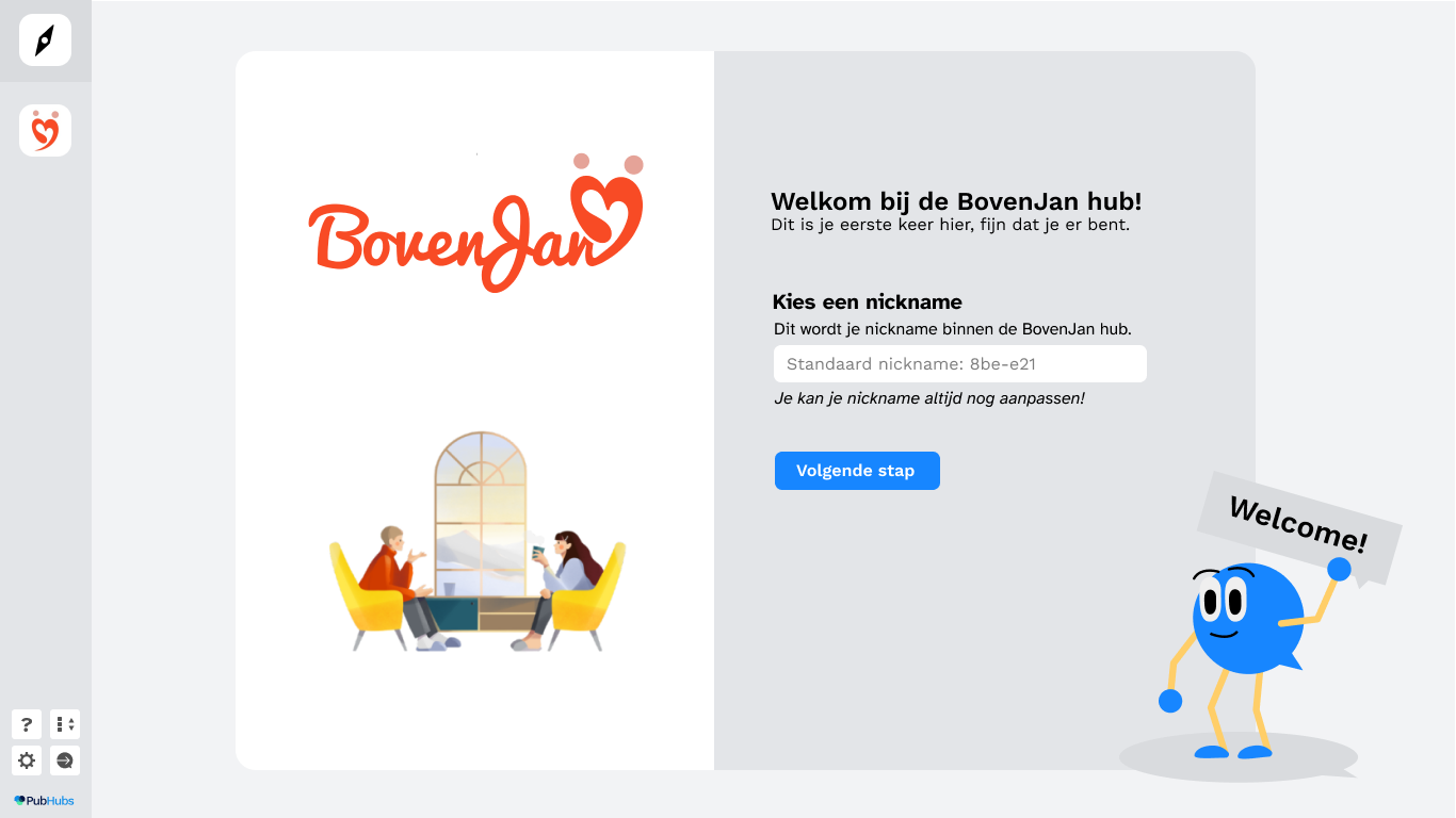
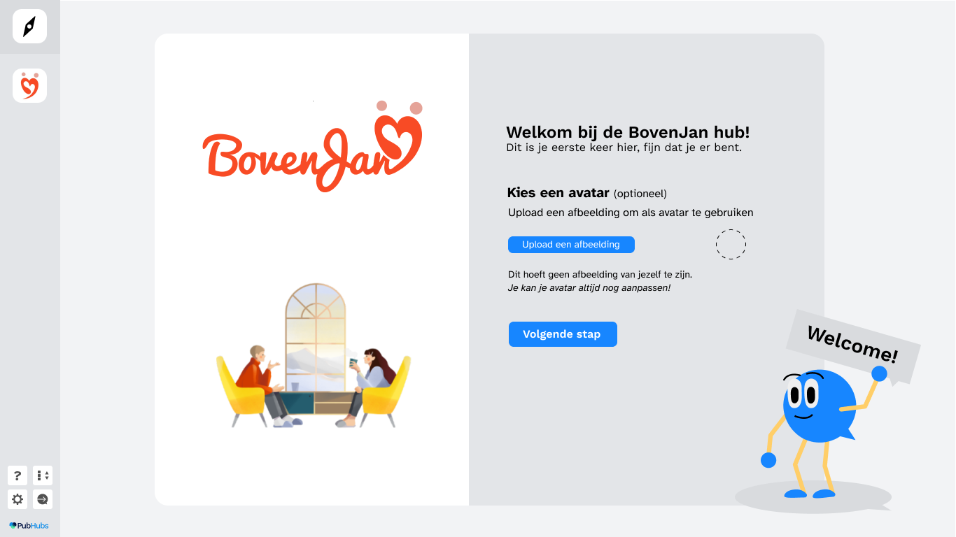
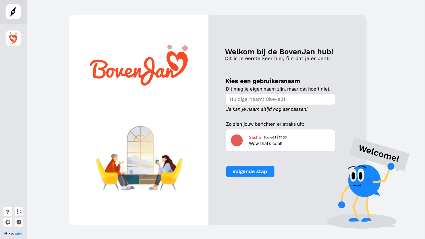
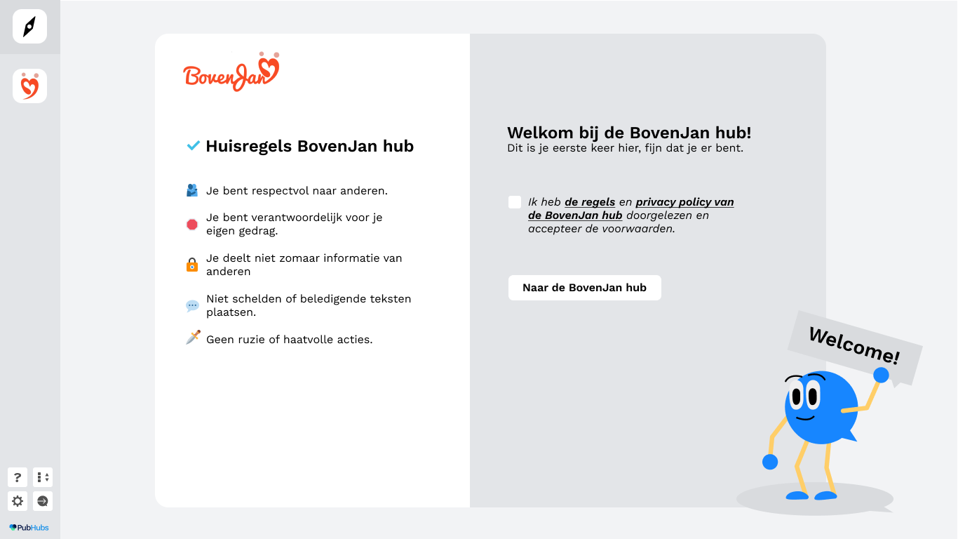
Hub onboarding & hub home The user can select a nickname and set up their avatar if they want to. Then they’re prompted to accept the rules and privacy policy. I made these into steps to make it as easy as possible.
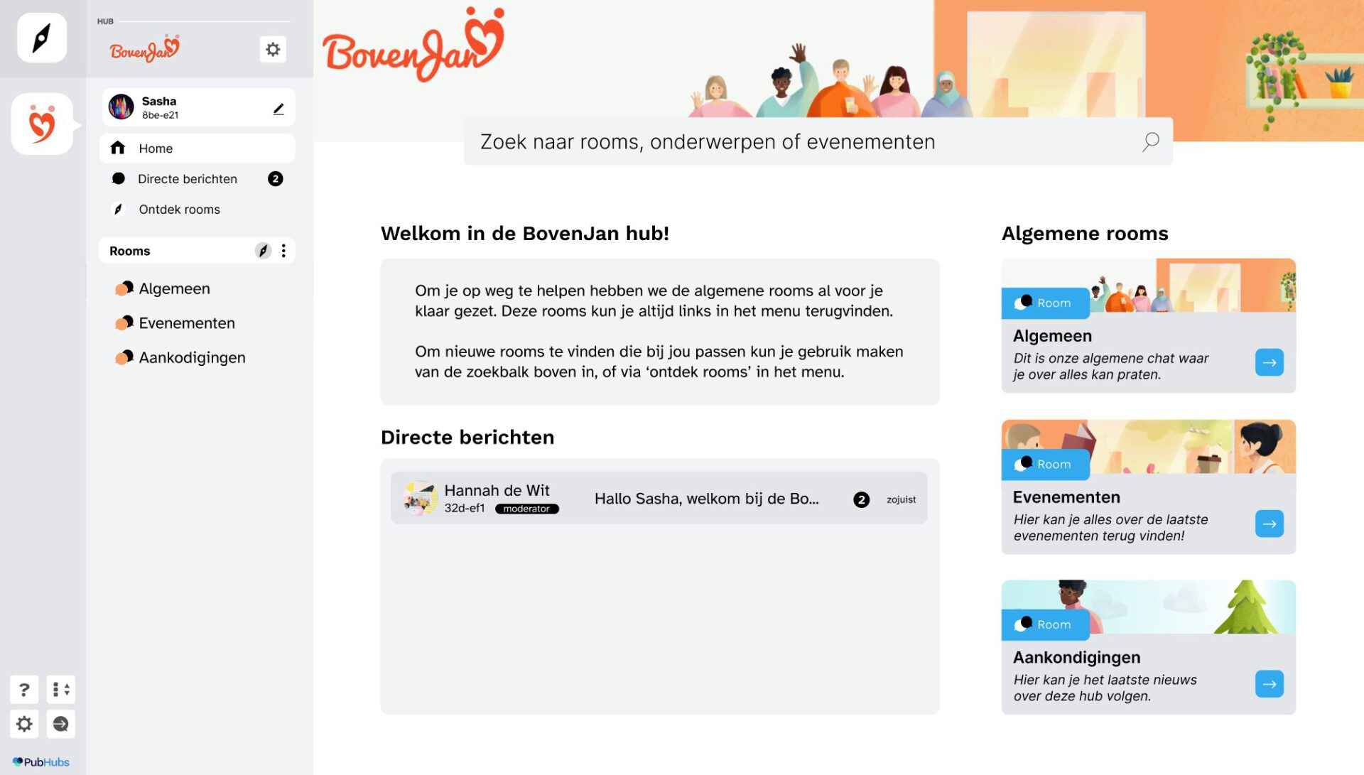
The hub home is the landing page where a user gets an overview of the hub. I wanted to test if the user was going to read the text and if they understood how to find a room.
🟢The onboarding UI was easy to navigate for all users 🟢Navigation bar on the left was clear for users. 🟠Some users had difficulty understanding the term ‘avatar’ 🟠Users ignored the rules and privacy policy 🟠Users didn’t read the welcome text
💡Key Insights
There was confusion about the relation between all the different parties, especially between PubHubs and Yivi.
Some users didn’t need to understand what Yivi was, and just downloaded the app and followed the steps. However for some others it raised questions.
Users expected layered information. Some users only read headings. Long paragraphs were skipped got skipped generally. Users liked the shorter paragraphs. However users did expect to be able to click for more information if they wanted to know more.
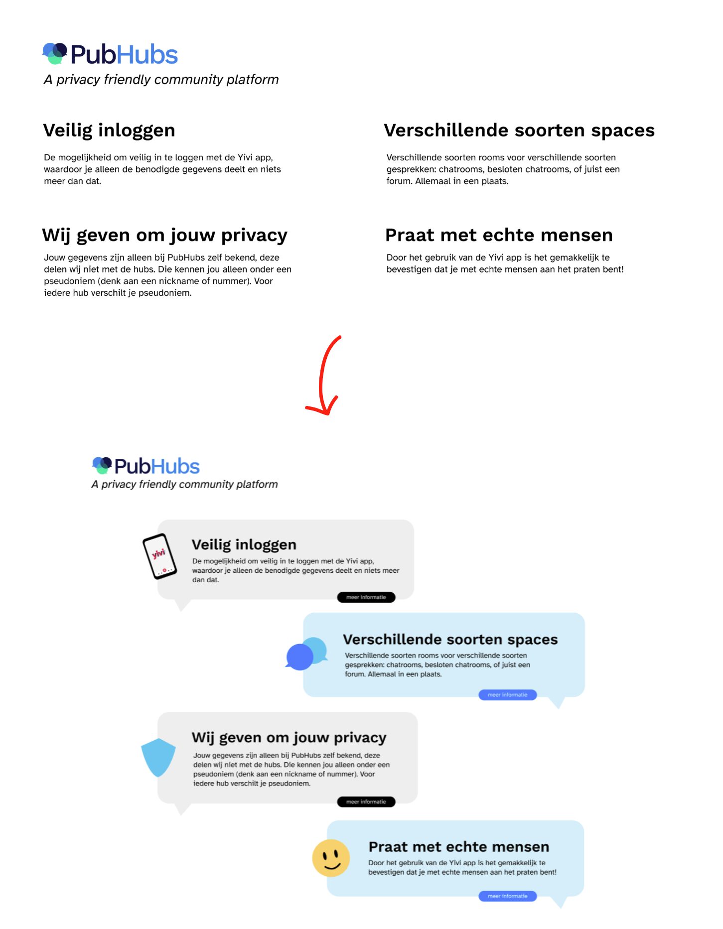
The USP texts about PubHubs gave a feeling of trust. Which was important to all the users. And they liked that it is privacy friendly. However the USP’s got skipped because of their location.
Users didn’t know what to expect after signing up to PubHubs.
Users had not shown any interest in reading the rules and privacy policy. Because the design doesn’t invite them to read.
Second iteration, interviews & insights
The second iteration I started this iteration out by looking at all insights and opportunities from the first iteration. I then created a plan of action and set some goals of what to improve before the next round of interviews.
Interviews were conducted the same way as before
Main changes In the second iteration we decided we were going to test another external website. Instead of having the registration flow on one page, I now have created steps, on the same page.
The hub information page One of the changes here was adding a screenshot of PubHubs itself to give the user insight as to what they can expect when signing up.
The second change was making the USP’s more inviting to read by adding some visuals.
Insights 🟢 The added screenshot made it clear to some users what to expect 🟢 More users read the USP’s and they got described as nice to read
🟠There needs to be more than 1 screenshot added 🟠The copy of the page needs to be more informative and inviting
🔴Users want to be able to look into the app before signing up 🔴The page still didn’t invite users to scroll down 🔴The difference between PubHubs and other parties is still unclear
The registration flow The main change I made here was making the registration proces into steps and adding some more visuals. I also added some more navigation up top.
Insights 🟢Users said the steps were clear and simple 🟢The FAQ was easier to spot for users
🟠The visual on the second step should contain a phone
🔴It’s still not clear to the user what Yivi is.
The FAQ being more visible to the users helps them with their questions surrounding Yivi.
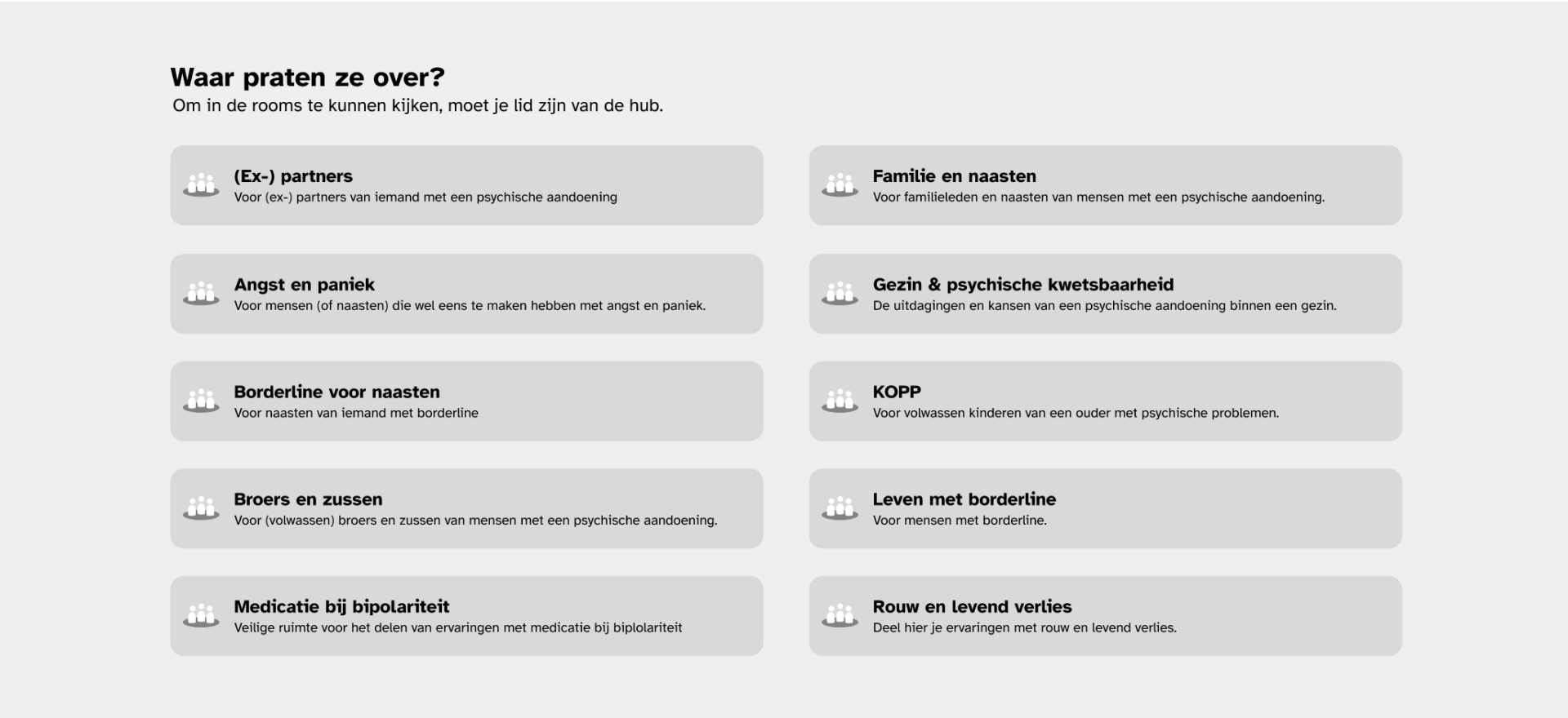
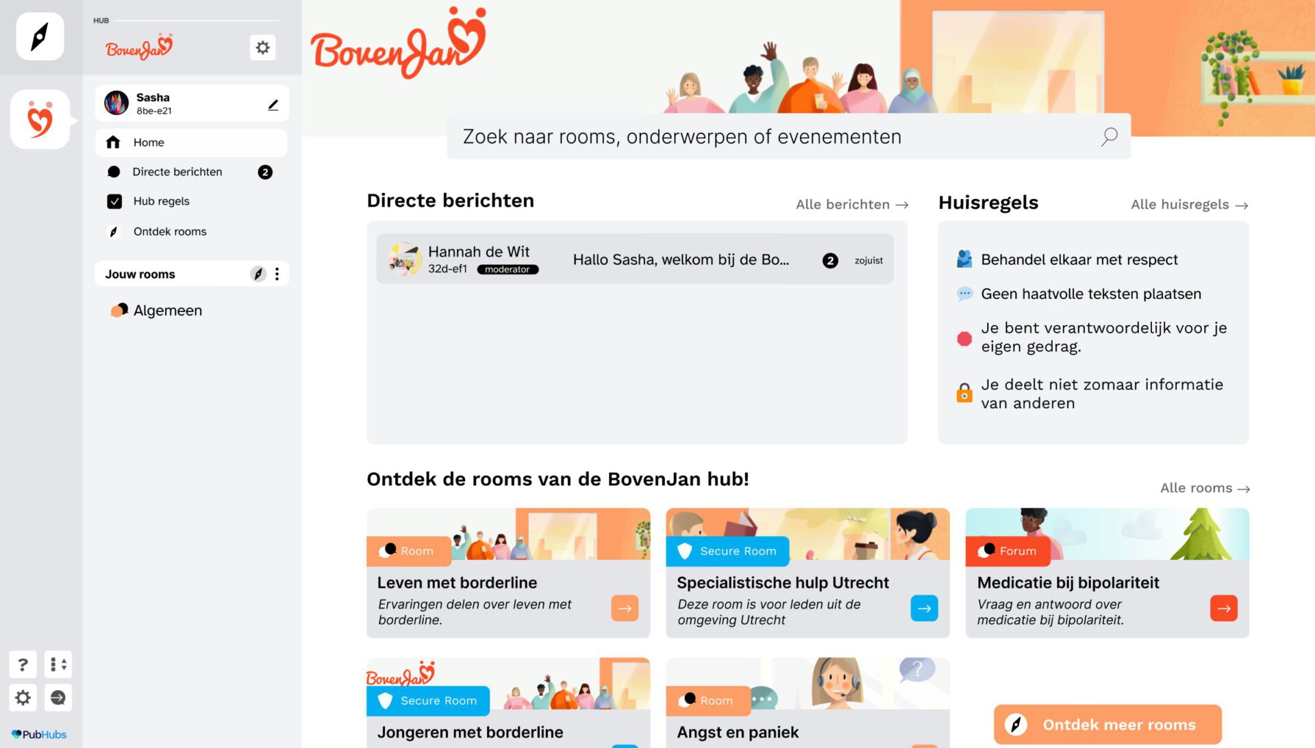
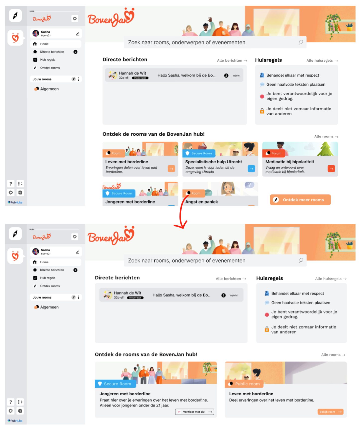
Hub onboarding & hub home I left out the avatar selection to lessen the steps. I made the rules more visual, and I shuffled around some elements on the hub home page to test if this way of showing rooms is clear to the user. I color coded the different types of rooms, to see if this made the difference clear.
Different types of rooms There are three types of rooms, regular chatrooms, forum-style rooms and ‘secure’ rooms which need you to verify something about yourself before you can enter. Example: you need to be older than 30 to enter room x.
Insights 🟢Users felt invited to read the rules 🟢Especially younger users were excited about secure rooms. 🟠Users didn’t notice the color coding of the room 🟠The homepage is a bit overwhelming 🔴Users didn’t understand the difference between rooms
💡Key Insights
The hub information page didn’t invite to scrolling again.
Users would’ve like more information about why PubHubs would be interesting for them.
There was still confusion about all the different parties involved. Especially Yivi.
Users would like a way to have a look at the conversations going on without having to sign up.
The first step of the registration proces still doesn’t explain Yivi well enough. The FAQ however was clear this way.
Yivi wasn’t trusted by some users and should be introduced in another way.
Users felt way more invited to read the text because of the visuals (we had some returning testers)
The hub home page was overwhelming, but the users were very positive about he layout.
It’s not clear enough for users what the difference between the rooms will be. The color coding did not work.
Third iteration, interviews & insights
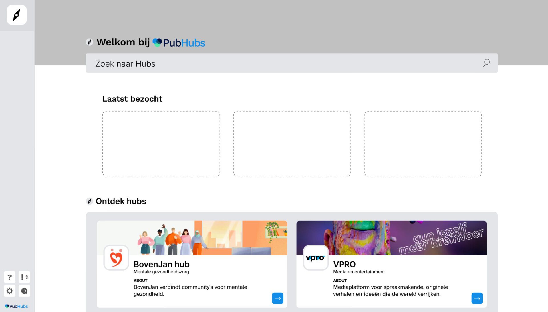
The third iteration I heavily focused on making Yivi clear to the user. This included some textual changes but also some visual changes. This time the user starts from a mock-up PubHubs homepage instead of an external link.
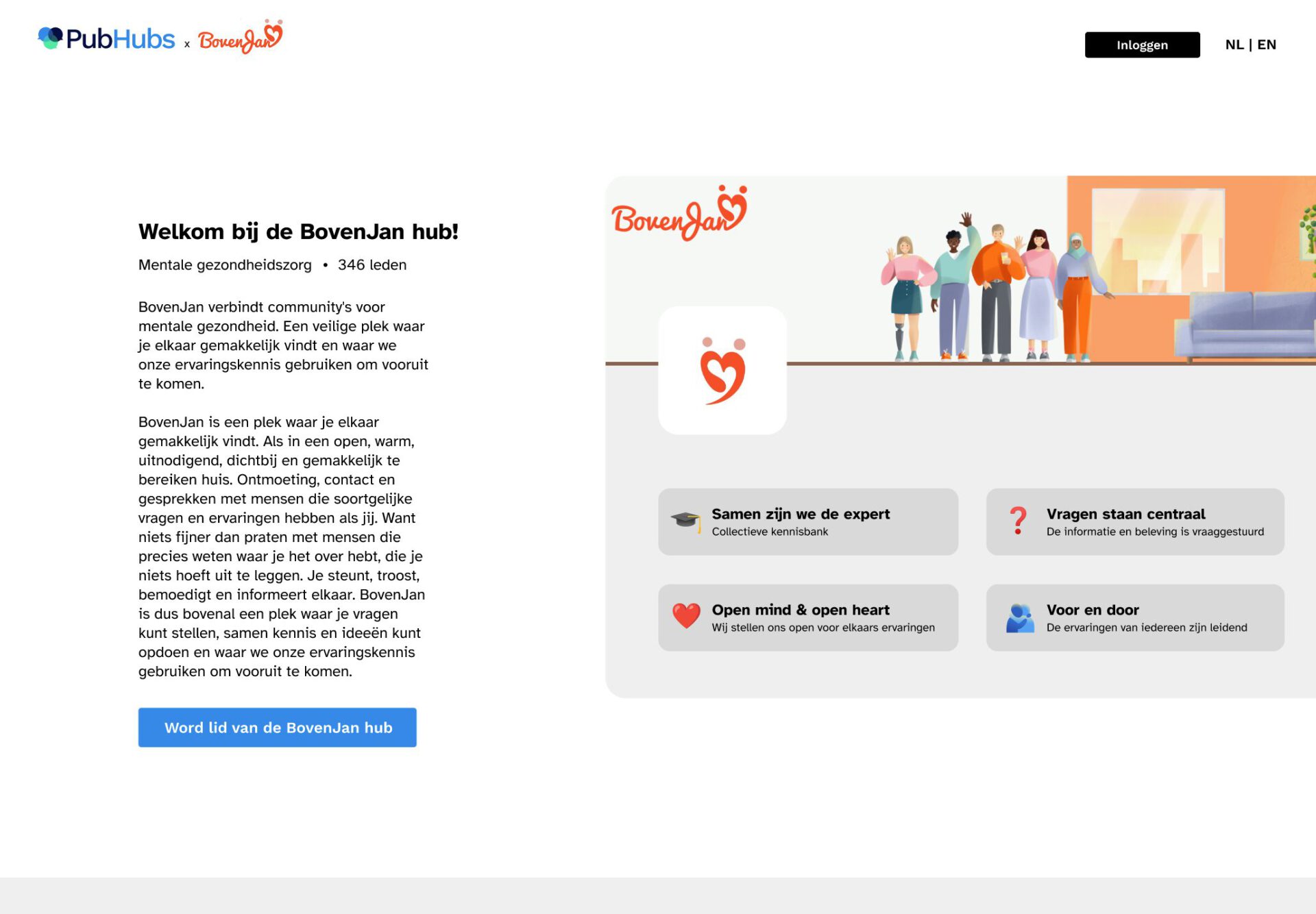
The PubHubs introduction/login page Because both PubHubs itself and Yivi both need more explanation, I combined the hub information page and a home page. I did this to emphasize PubHubs itself. I also tried to make it clear that Yivi is a third party.
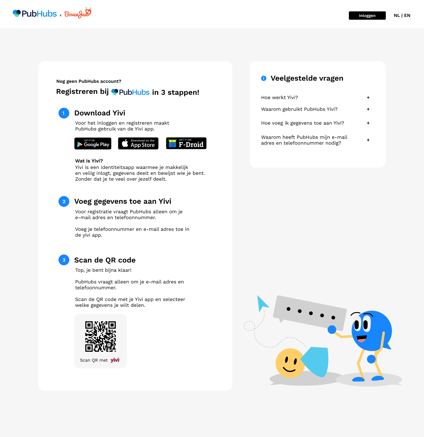
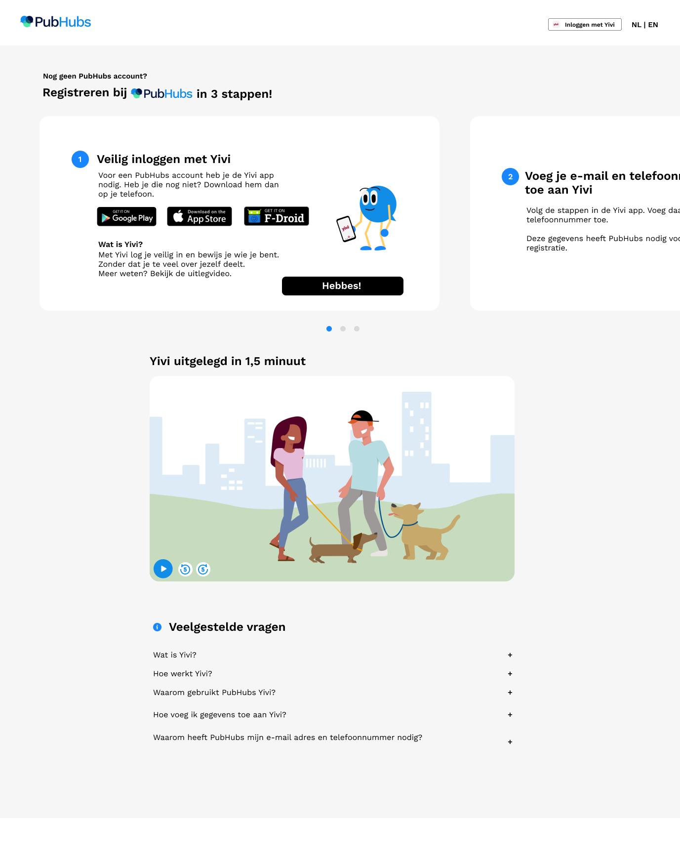
Inspiration I went on a inspiration exploration, to look for other websites that use a QR-code or an app for logging in. Which led me to some banks and insurance companies. But most importantly it also led me to DigiD which is similiar to Yivi. (DigiD is an app you can use to log in to Dutch government instances)
Almost everyone in the Netherlands knows DigiD, because it’s necessary to do your taxes for example. This is why in my new design I implemented a ‘log in with yivi’ button, which mimics the DigiD button and is also similiar to log in with Google.
With this change I hoped to achieve a sense of familiarity for the users.
Insights 🟢PubHubs got compared to discord and reddit by some users 🟢The added screenshot gave a clear view of what to expect 🟢Users loved the USP’s and they were inviting to read through
🟠Encountering the Yivi name without explanation is confusing
🔴Users still want to be able to look into hubs before signing up 🔴It still wasn’t clear what PubHubs was on first sight.
The registration flow I added a Yivi explainer video, and made some textual changes.
Insights 🟢Steps 2 & 3 were no problem at all 🟢Yivi got compared to DigiD, because of the log in with Yivi button
🟠The explainer video explains Yivi very well, but not many users were tempted to watch the video
🔴Some of the elderly users found it to be too much of a hassle to dowload the Yivi app 🔴There were a few elderly users who were confused as to why they had to take out their phone while they were using their desktop.
Hub homepage I increased the size of the individual room elements to be less overwhelming for the user.
Insights
🟢Clear navigation 🟢Not overwhelming
🟠Rules don’t need to be repeated 🟠There was a bit of confusion as to why Yivi was needed again
🔴The difference between types of rooms wasn’t clear
PubHubs discover hubs This is the page a user gets to see right after registering, the gray banner should be replaced by an illustration.
🟢Users had liked it’s simplicity
💡Key insights
By making the ‘log in with Yivi’ button look more like DigiD, more people compared Yivi to DigiD. Which in return made them understand Yivi better.
However it’s not completely clear yet for the user how Yivi works. The explainer gave clarification on this, however users didn’t feel stimulated enough to watch the video.
It still wasn’t completely clear what PubHubs was, but after a bit of scrolling it became clear. The position of the screenshot was too far down.
Users wanted to see more information about the hub before joining. (bringing back a hub information page or something similiar)
Elderly users didn’t like that they had to give their phone number for registering.
The different room types are not clear yet, this is both because of textual problems and because the different colors aren’t obvious.
Reflection & conclusion
Working together with a UX researcher taught a lot about how to ask questions when testing with users. It also gave me a new perspective as I have been the only designer on this project for over 2 years. So it gave me a fresh look at the project again.
Working with the design restraint of using Yivi has always been a challenge. The last iteration was a big step forward to making it easier to understand for users. It also reminded me of how important inspiration exploration is.
One of the main lessons I have learned is that users around 85% of users don’t read text if it’s not short.
The research gave me lots of opportunities to improve the UI based on the user feedback.
The compliments and positive feedback on the current designs really boosted my confidence, and was a sign I’m on the right track.